

Services
Industry
Year
Timeline
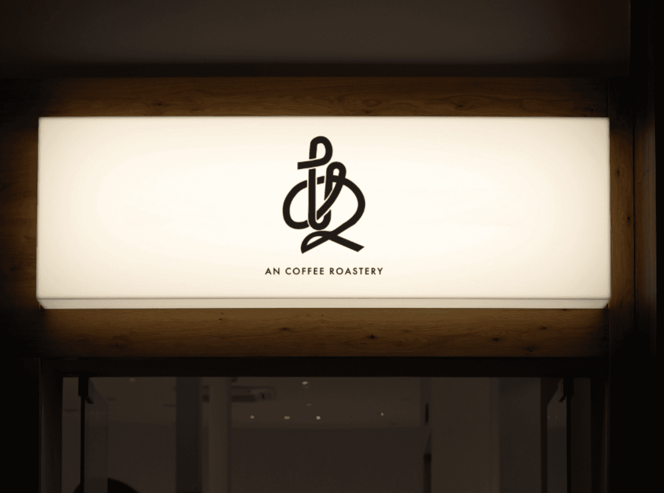
A logo design created for An Coffee Roastery, a coffee roastery based in Osaka, Japan.
Inspired by the two Japanese hiragana characters “あ” (a) and “ん” (n) that form the brand name, the design brings together the gentle character of Japanese typography and the calm, welcoming atmosphere of a coffee roastery within a single symbol.
The two characters are seamlessly connected in a continuous, single-stroke-inspired form, creating a distinctive visual expression of the brand name itself. While preserving the recognisable characteristics of hiragana, careful attention was given to the flow of the lines, the curves and the balance of negative space, ensuring that the result feels like a unified symbol rather than simply two letters combined.
By keeping the composition minimal and free from unnecessary decoration, the design achieves a refined yet approachable appearance, balancing the meaning of the characters with the visual impact of a memorable brand mark.
Versatility was also an important consideration, ensuring that the logo works naturally across a range of applications, including shop signage, business cards and coffee packaging.
Combining the softness of Japanese hiragana with the strength of a distinctive visual symbol, the final design captures the calm and welcoming identity of An Coffee Roastery.
Explore more projects.
Explore more of my work, from Japanese-inspired logos to contemporary brand identities, each thoughtfully designed to reflect the character of the brand.

