DESIGN STORY
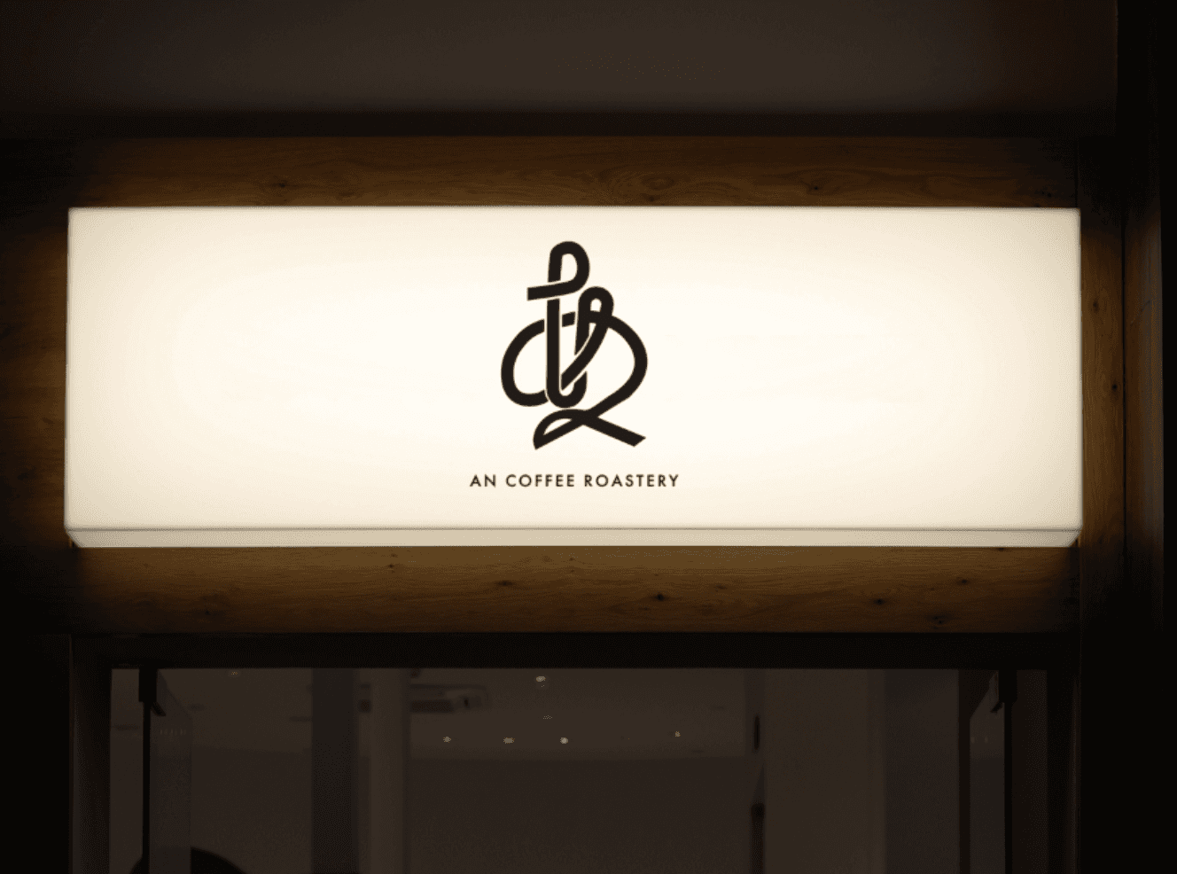
I combined the Japanese hiragana characters “a” and “n” from the brand name into a natural, flowing form reminiscent of a single brushstroke.
While preserving the softness of hiragana, I carefully refined the weight of the lines, negative space and overall balance to strengthen the symbol’s clarity and recognisability.
By keeping the form simple and avoiding unnecessary decoration, I created a distinctive brand mark designed to remain memorable across a wide range of applications, including signage, branded cards and packaging.
LOGO
